About

Hello, welcome to Atlas Folio!
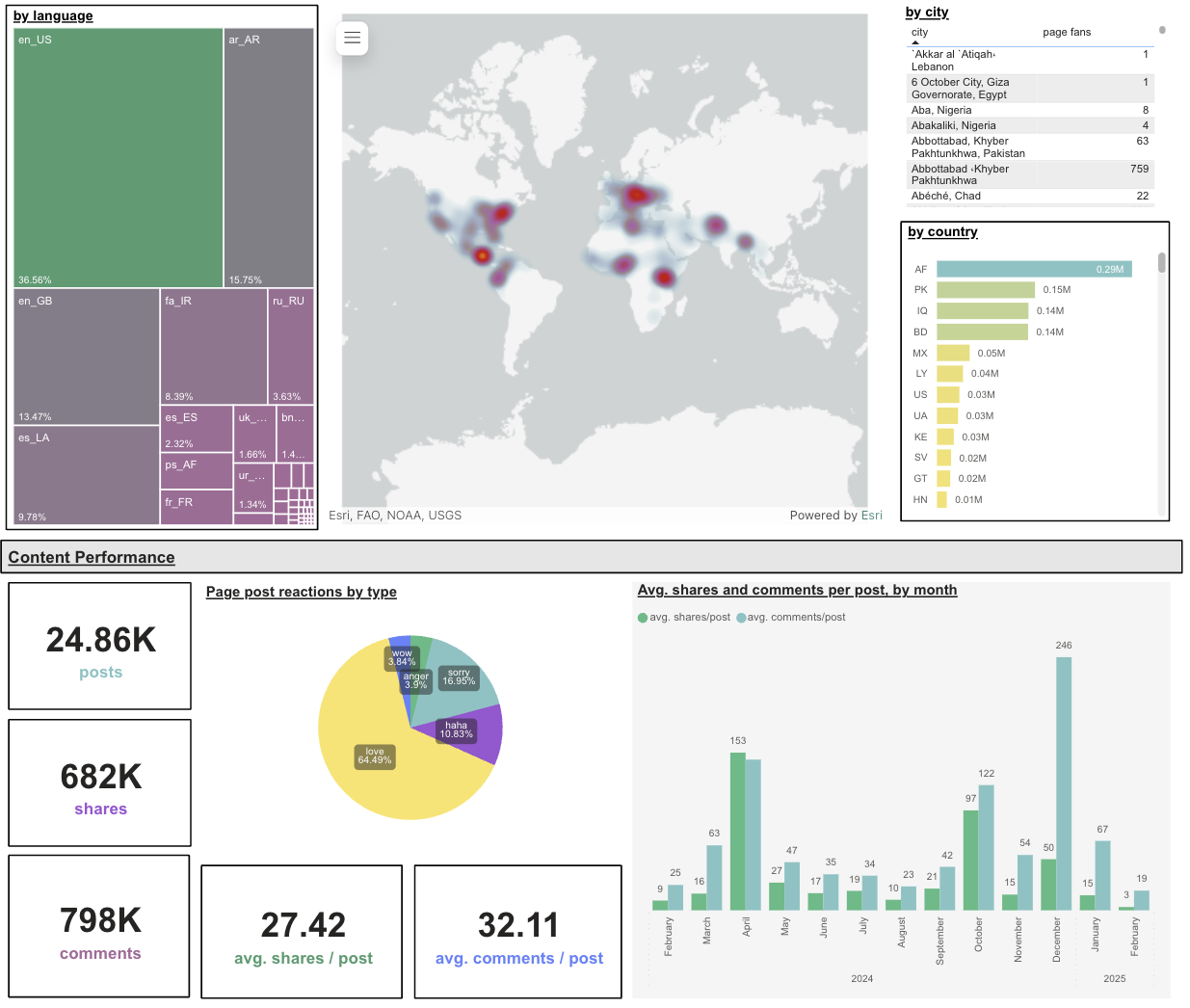
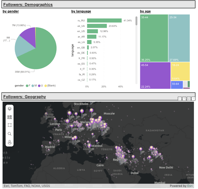
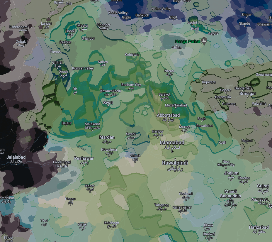
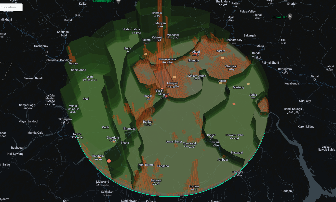
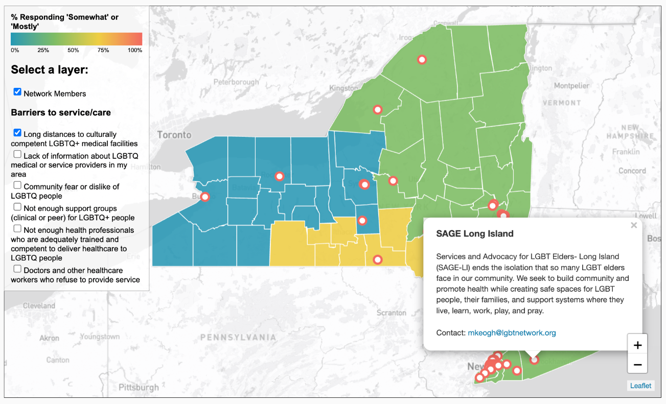
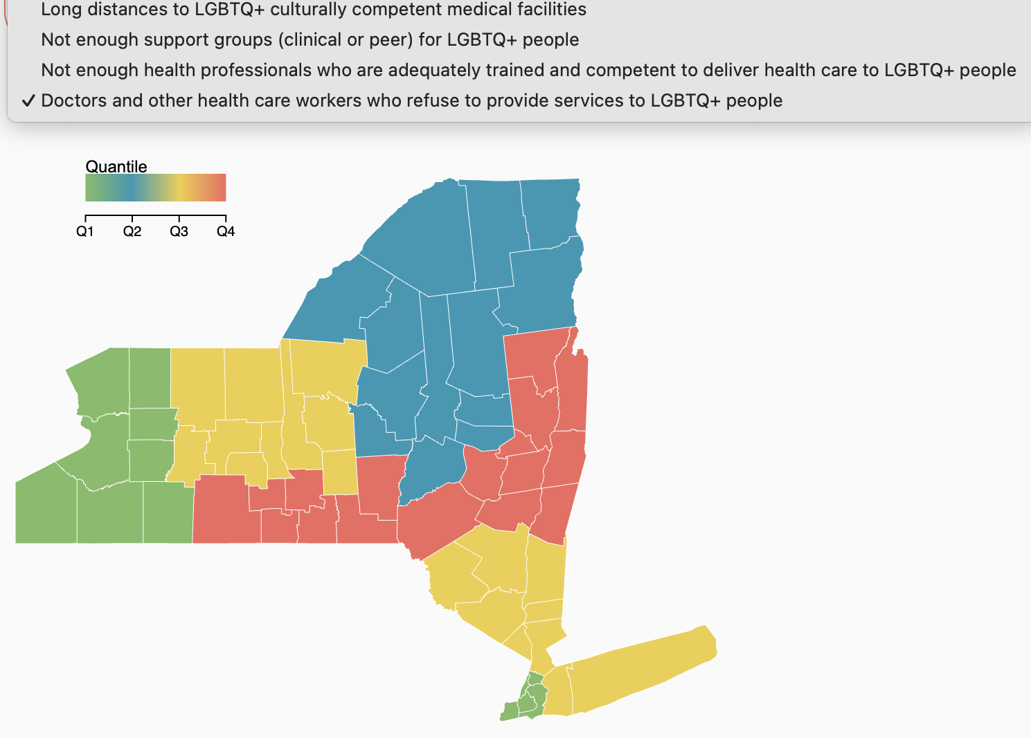
I am a data professional with expertise in data visualization, data science, data engineering, and ethical AI development, with several years experience building scalable data ecosystems and impactful data solutions with Python, SQL, and cloud platforms.My work has touched on the themes of anticipatory climate action, humanitarian and disaster response, as well as urban and transportation planning. My area of technical expertise includes building interactive data visualizations and dashboards, geospatial work, working with APIs and data pipelines, as well as in impact and measurement strategy.
With an ever-growing curiosity for the world that surrounds me, I geek out on all things data visualization, geospatial, and urbanism. In my spare time, you will find me exploring new parts of the city, planning my next travel adventure, dabbling with a new language, or by the water sailing, swimming, and paddle-boarding.
